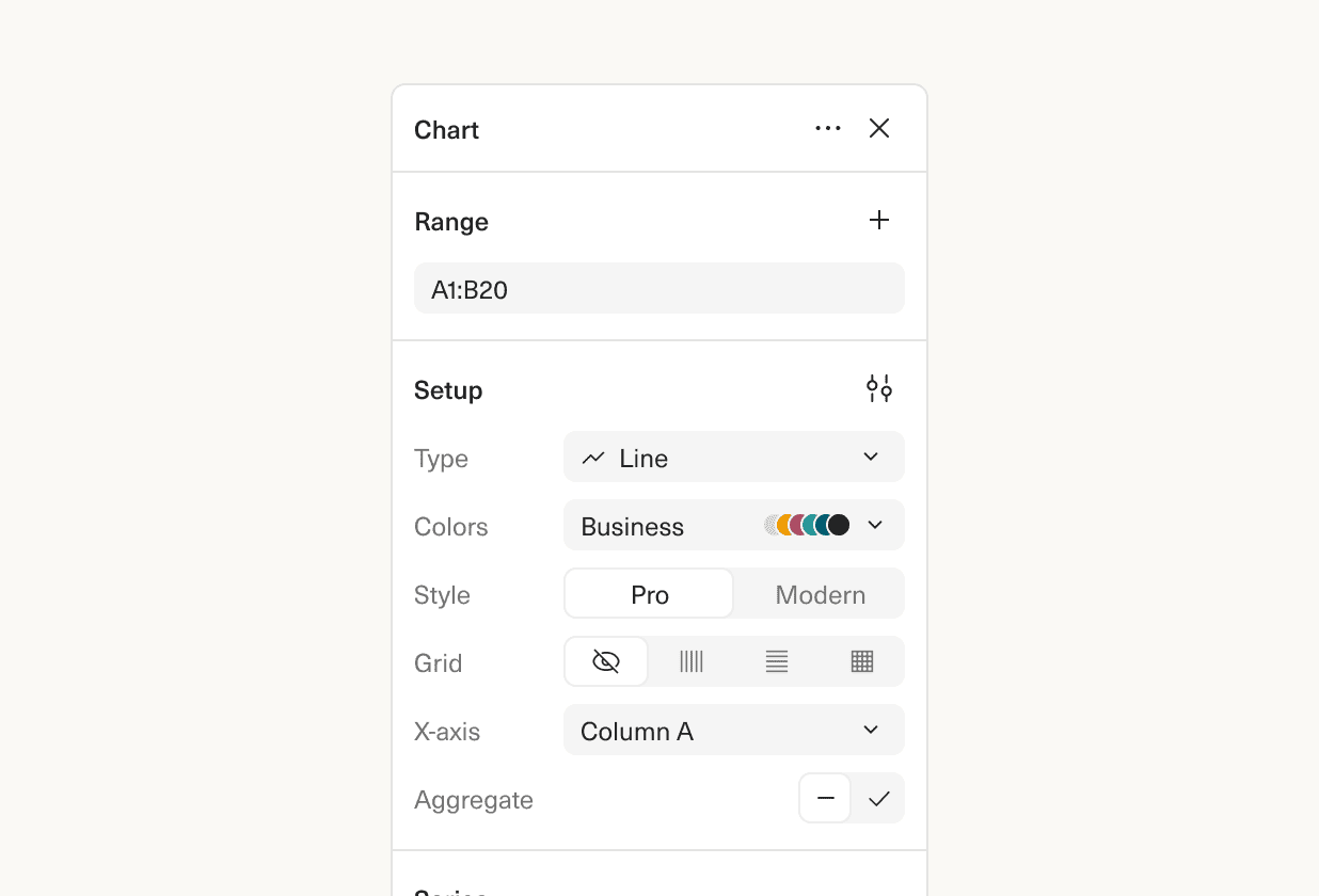
Building the chart you want is faster and easier, with our redesigned charts sidebar.
The biggest change: all chart options are accessible in a single panel, no more switching tabs or expanding sections to find the option you want. One example of the impact: before, adding a label to a series was four clicks, now it’s just two.
There’s some new functionality and bug fixes as well. You can now re-order series and sort x-axis values. We’ve improved how blank values are charted, and made it easier to create pie charts.
 Martin Rariga
 Robert Long
 Ryan Fauver