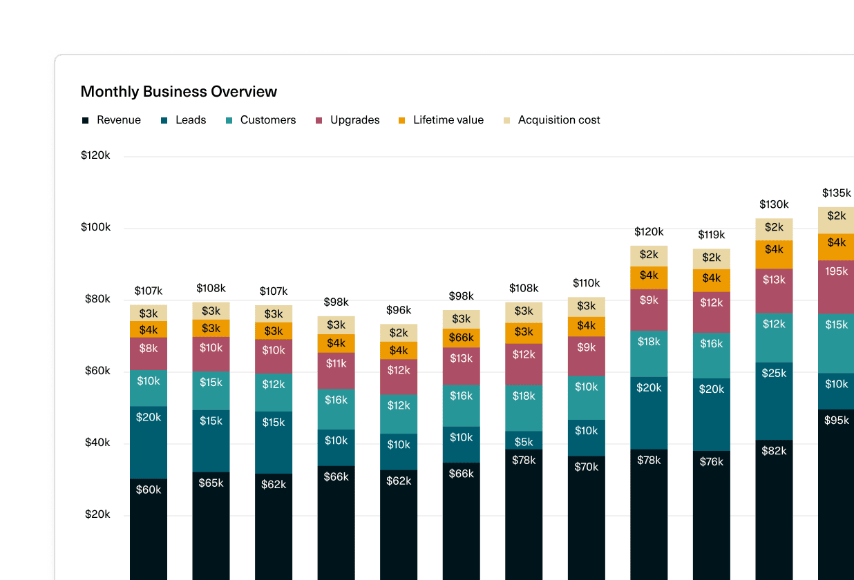
Inspired by customer feedback, we’ve introduced two new chart styles:
- Modern - fresh and fun, with rounded edges, smoothed lines, lighter labels, and vibrant colors
- Professional - classic and authoritative, with straight edges, heavier labels, and traditional colors
New color palettes can be applied to charts based on the selected style:
- Bright or Cool (Modern)
- Business or Basic (Professional)
- Purple or Stone for a monochromatic look (both styles)
As always, you’ll still be able to customize the color of individual series and create your own custom color palettes for reuse across your workspace.
For a complete summary of what’s new and improved with charts, see this help doc.
 Willy Collins
 Madeleine Revill
 Martin Rariga