The Guide to
SaaS Metrics
The Guide to
SaaS Metrics
Table of Contents
- Introduction
- Metrics to Measure
- Operationalizing Metrics
- Visualizing Metrics
- Sharing Metrics with Your Board
- Fundraising with Metrics
- Good Luck Out There
- Appendix
Find the levers to grow faster →
GTM analytics that shows you what's working — and what's not.
Visualizing Metrics
- By
-
 Bobby Pinero
Bobby Pinero
Bobby Pinero
15+ years of corporate finance experience, currently co-founder at Equals and board member at Intercom.

You’ve nailed down your operational metrics and wrapped up your analysis, and now you’re ready to share your insights to spur action from your team.
It’s tempting to jump straight into adding your exploratory visuals to your dashboard or presentation. But remember, just because you’ve been neck-deep in the data doesn’t mean everyone else has. Without taking a moment to consider the story you want to tell and the best way to tell that story, you’re likely to overcomplicate things or drop contextual information that’s needed to guide your audience to the right conclusions. The way you choose to communicate and visualize your analyses can make or break the conversation.
Remember your audience
Before you dive in, take a step back to establish the foundation of the story you want to tell: Who is your audience, and what actions or decisions do they need to make?
This should inform the format and style with which you deliver your insights. For example, a detailed deep dive might be best communicated via a live presentation that structures specific data points in a guided sequence. For ongoing monitoring of business performance, a dashboard with a consistent set of metrics and visualizations would allow stakeholders to track trends more easily over time.
Another factor is the size and setting of the group you’re working with. For smaller groups that meet live, you can afford to deliver more complex, data-rich presentations because you’ll have the opportunity to walk your audience through the findings and discuss what they mean. Here, there’s little chance of misalignment or conflicting interpretations.
If you’re working with a particularly data-savvy group, providing a higher density of data will empower stakeholders to explore and extract valuable insights on their own. At Intercom, this came into play when an enterprising product manager informed us that the way we were modeling customer lifetimes was all wrong. After exploring the data independently, they realized that we were modeling a linear deceleration in revenue over time rather than an asymptotic one. The implication of this change had a huge impact on how we valued the self-serve business and, by extension, on our decision of whether or not to invest in it.
On the other hand, when working with a broader group, such as a team all-hands, you’ll need to define a streamlined and consistent set of metrics and visualizations that are easy to interpret at a glance. Since you don’t have the luxury of aligning on the takeaways live, this approach will help avoid any potentially paralyzing misinterpretation down the line.
Establish your story
Next, consider the core message or insights you want to convey to that audience — your “so-what”. Ideally, this is a tight, 1-2 sentence statement that gets to a) the core insight and b) the decision that this insight needs to inform. For example:
- Insight: Our self-serve business has unsustainably high churn.
- Decision: We need to double down on improving retention or re-consider our go-to-market strategy.
Use this statement to storyboard the sequence of datapoints and insights that lead up to your “so-what.” This will ensure that your story is tightly organized, logical, and easy to follow.
Why take this step? Stakeholders who open a busy, disorganized, and overly dense document or presentation will all too often “check out” of the conversation before it’s even begun. It’s human nature — we have a limited amount of time and attention, so things that take a lot of energy to process for an uncertain payoff will tend to be put on the back burner. Organize your data in a tight, logical sequence, and your audience will be less likely to “lose the plot” and more likely to walk away with a shared understanding of what’s going on and what needs to be done about it.
As a general rule of thumb, for a guided presentation you should be able to read just the titles of each slide to grok the “so-what” and its supporting narrative. When creating a dashboard on the other hand, you’ll want to follow a logical flow that helps your audience keep track of the relationship between different sections. Taking a sales pipeline dashboard as an example, you can move from north to south across the pipeline, starting with acquisition (leads), then conversion (closed opportunities), and finally, the bottom of the pipeline (won/lost revenue).
Use the right visualization
Now that you’ve established the flow of your story, you’re finally ready for the fun part: creating visualizations — tables, datapoints, and charts. Here, be very intentional about selecting the visualization that best expresses each takeaway in your story. There are many types of vizualizations and ways of styling them, but in our experience, just a handful of the most fundamental types will cover 85%+ of your needs.
Here are some best practices to keep in mind.
If you’d like to follow along with an example of these best practices in action, you can refer to this example Equals dashboard.
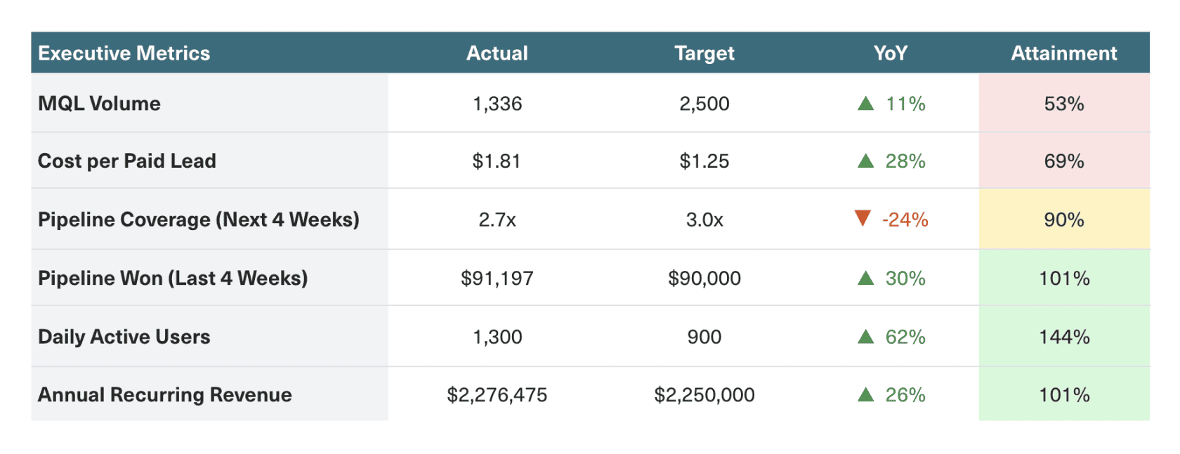
Tables
Tables are great for summarizing multiple metrics relevant to a specific aspect of the business in a single view. This is especially true when those metrics use varying units of measurement and scales of magnitude and are, therefore, impossible to plot on a single chart.
You can also add visual cues to tabular vizualizations to make it easier to scan and surface trends. For example, use arrows and color coding to illustrate the directionality of changes or goal attainment.
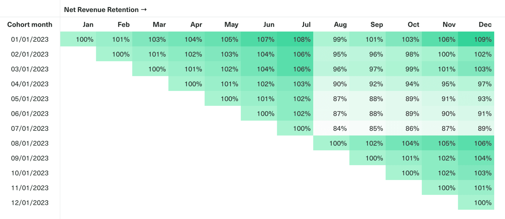
Alternatively, you can use heatmaps to illustrate relative magnitude. This allows you to retain the datapoints needed for precise comparisons (e.g., across customer cohorts) while also enabling your audience to see the signal amid the noise. For example, the conditional formatting in our cohort table below allows us to quickly identify the drop-off in retention across all cohorts in August 2023.
Use for:
- Executive summaries presenting multiple metrics with varying units and scales in a single at-a-glance view.
- Cohort analyses tracking and comparing behaviors across customer cohorts at a high level of fidelity.
Best practices:
- Add visual cues like conditional formatting to highlight trends and datapoints (like outliers or performance against targets).
- Label all columns and rows, and consider including a brief description to provide context for the data.
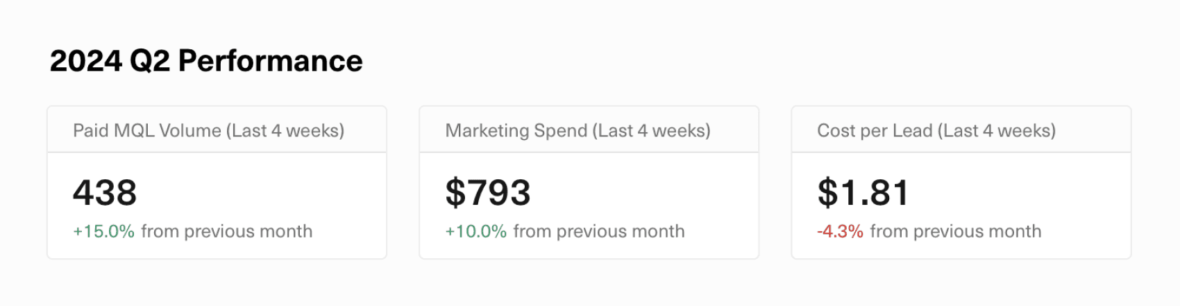
Single Datapoints
Display single datapoints in situations where you’re willing to trade off providing visual context for more visual clarity. This is especially true when presenting hero metrics with targets that your stakeholders would already have context on. When combined with color coding and diff comparisons, you can show these hero metrics at the top of dashboards to enable stakeholders to assess what’s changed and what’s on or off track in a single glance.
Use for:
- Communicating hero metrics (e.g., goals and KPIs) that don’t need visual context or interpretation.
Best practices:
- Use color coding (e.g., green/red to show how a metric is pacing against goal) and diff comparisons (e.g., relative/absolute change over time) to highlight trends and status.
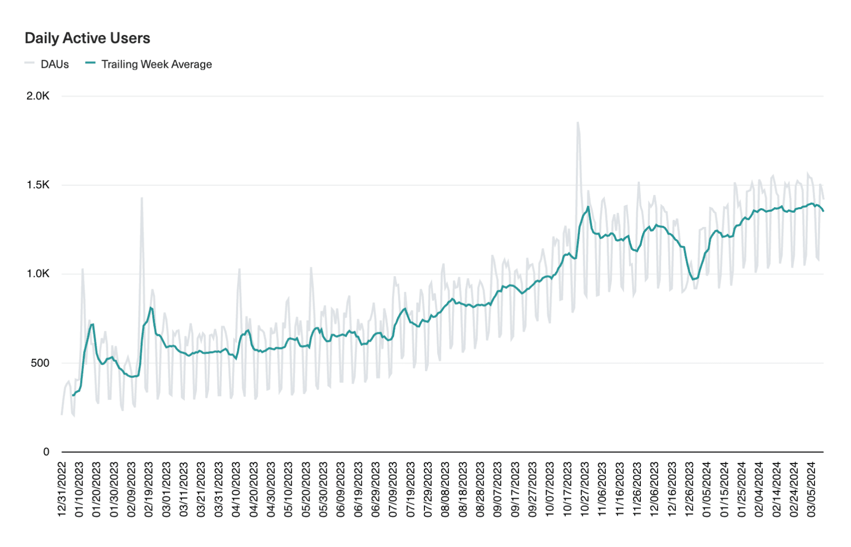
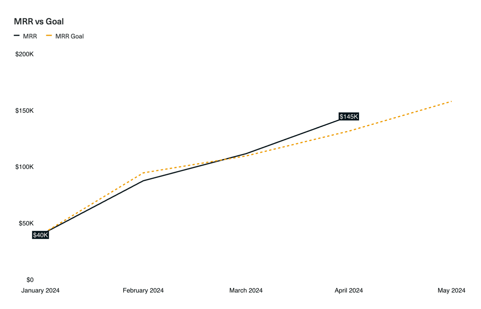
Line Charts
Line charts are best for showcasing continuous data like time series. The more time periods you have, the more useful it is to present the data using a line chart than a column chart. This is why engagement metrics are most often plotted using a line chart — here, a line chart would allow you to hone in on the directionality of change over time, while bars are overwhelming.
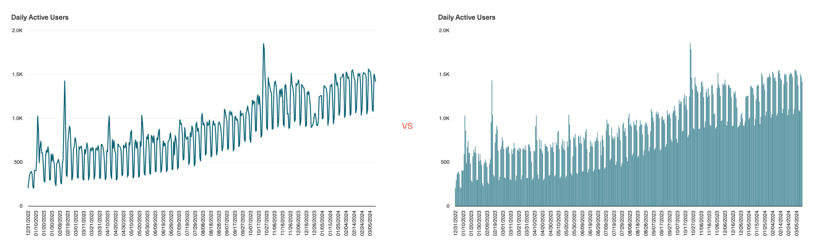
To aid interpretation, you can overlay your raw data with trendlines and moving averages that smooth out spikiness in the data. Here, you’ll want to use color to selectively draw the eye towards what matters most.
Use for:
- Displaying continuous time series data to show trends, patterns, or fluctuations over time.
Best practices:
- Maintain a zero baseline if possible to avoid misleading representations of magnitude.
- Annotate significant datapoints or changes to guide viewer interpretation.
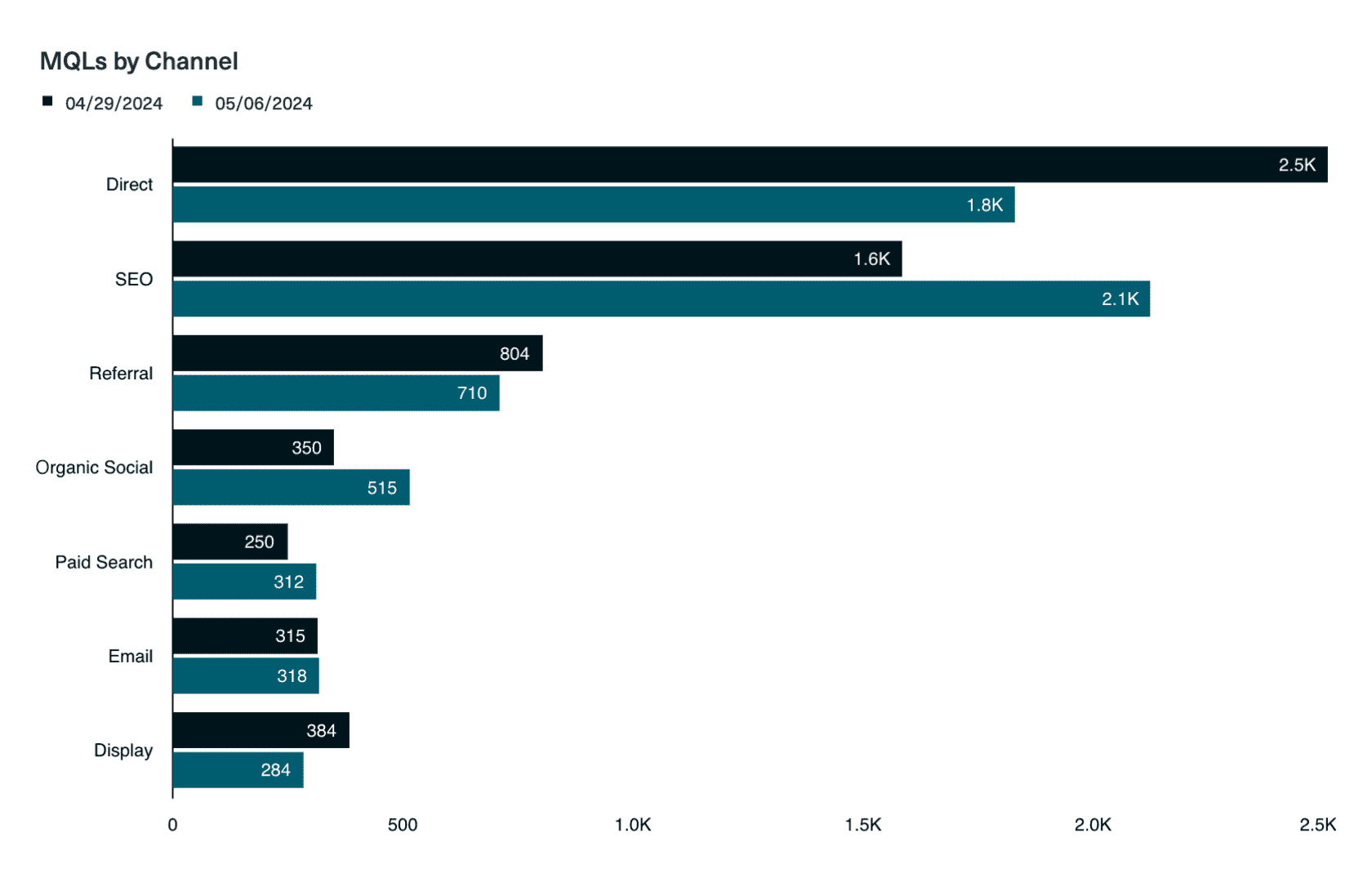
Bar and Column Charts
Bar and column charts differ only in their orientation — column charts are vertical, while bar charts are horizontal. Both chart types are best used for displaying the relative magnitude of categorial data such as customer segments, marketing channels, or pipeline stages.
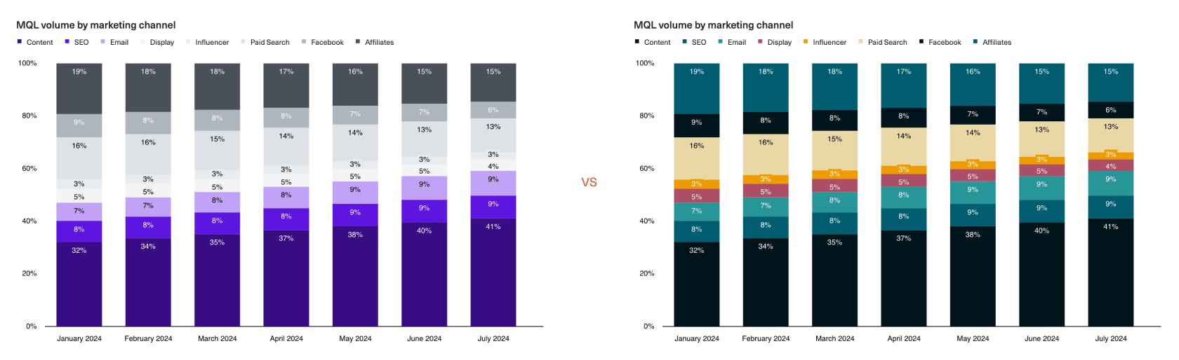
We always recommend using a bar or column chart rather than a pie chart for this use case because it’s unintuitive to discern the relative size of each “slice” of a pie, but much easier to compare the length of each bar. Just take a look at the charts below — how quickly can you find the pipeline stage with the greatest deal value on the left vs. on the right?
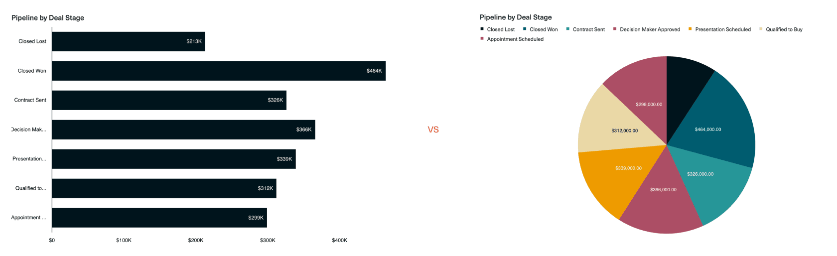
When reading from left to right, viewers will first scan the category names, and then notice the differences in value between the bars. When used to compare categories across a single or small set of time periods, a bar chart makes it very easy to identify the categories that saw the biggest change across periods.
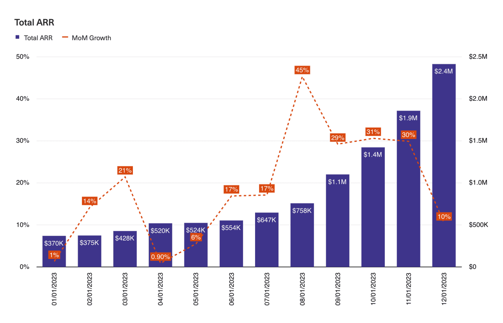
On the other hand, column charts are more commonly used for time series analyses — here, the emphasis is on tracking fluctuations in magnitude within a single category (e.g., changes to ARR over time). However, we’d recommend only using column charts when comparing across relatively few time periods (e.g., 12 months in a year) to avoid overwhelming the eye. You can also overlay column charts with lines — also known as a combo chart — to illustrate trends like period-over-period growth or goal attainment.
Use when:
- Comparing quantities and magnitudes across different categories.
- Comparing the magnitude of categories across one, two, or a small set (<20) of time periods.
Best practices:
- Maintain a zero baseline to represent true proportions across categories.
- Use horizontal bars to emphasize category comparisons (when reading from left to right).
- Avoid over-complicating visuals with too many series.
Stacked Column Charts
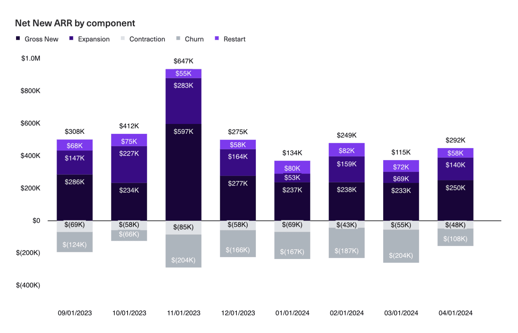
Like column charts, stacked columns are useful for comparing magnitude across categories. However, stacked columns add another piece of contextual information — the mix within each category. This is useful for breaking down business drivers into parts, such as marketing spend by channel, deal volume by pipeline stage, or the contribution of each component of ARR.
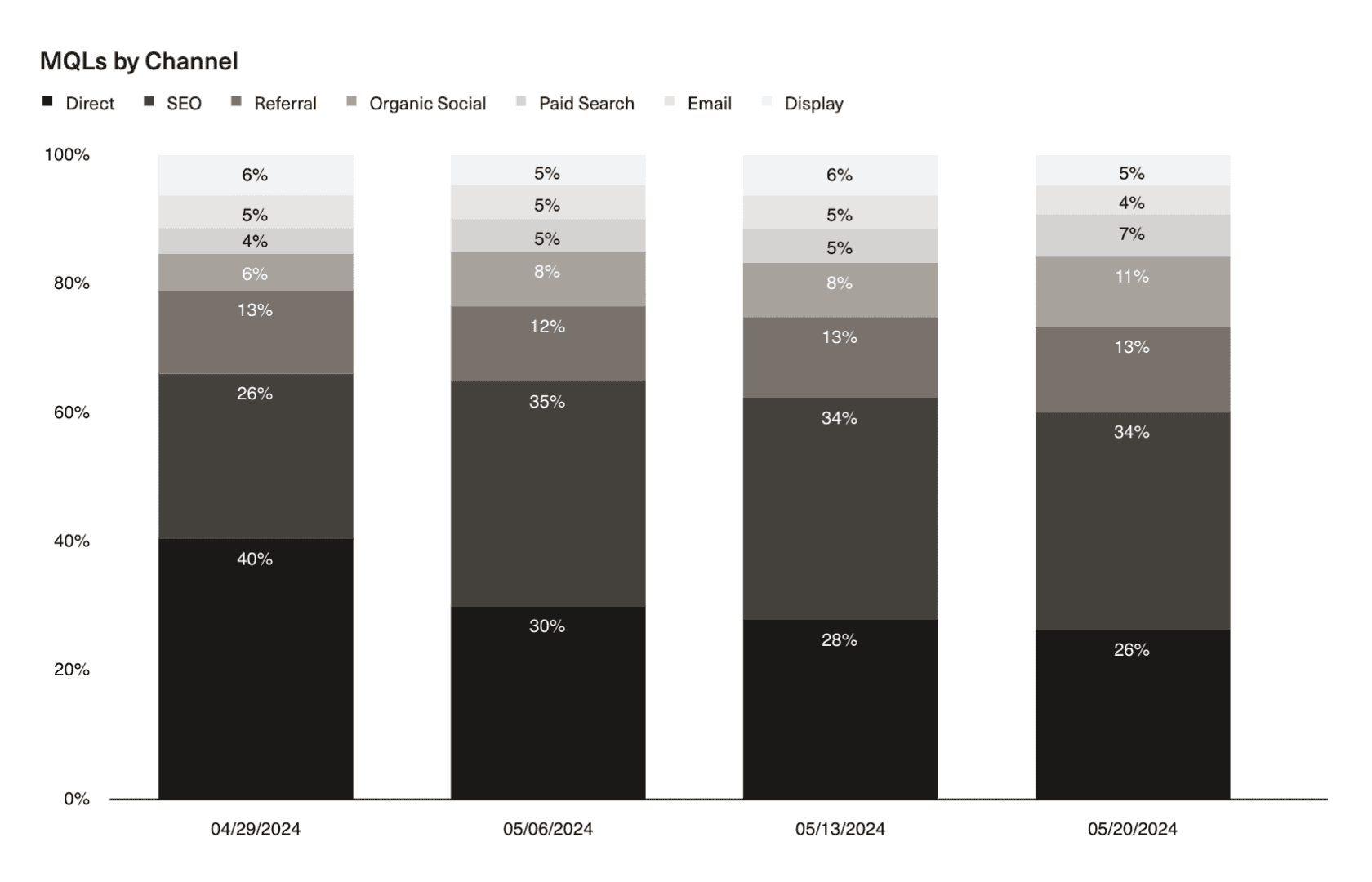
If you want to focus on just comparing trends across categories, use a 100% stacked column chart. This normalizes the height of each column so that you’re left with just the relative size of the stacks.
Use when:
- Comparing totals across categories and part-to-whole relationships within categories.
Best practices:
- Ensure clarity by not stacking too many sub-categories, and use contrasting colors to clearly distinguish the most important categories.
- Use a horizontal bar chart to emphasize categories (when reading from left to right).
- Use 100% stacked bars to focus on comparing relative proportions rather than absolute values.
Scatterplots
Scatterplots are a more exploratory chart type best used to illustrate potential relationships or correlations between two variables. By not drawing a “line” between the points, you’re being less prescriptive about the nature of that correlation and allowing your audience to draw their own conclusions. You’re also able to truthfully illustrate the impact of things like clusters and outliers.
Use for:
- Illustrating the potential relationships or correlations between two variables.
- When exploratory data analysis is needed to identify trends, clusters, or outliers.
Best practices:
- Ensure the data is continuous (e.g. a time series).
- Label axes clearly and incorporate trendlines to show the directionality of change.
Reduce visual complexity
Every visual detail that you add to your charts — such as data and axis labels, tick marks, titles, and legends — adds to the cognitive load required to interpret and process the takeaways. Help your audience along by removing unnecessary details so you only show what’s necessary to build up to a vizualization’s “so-what”.
For example, you’ll almost always want to show your axis labels. In virtually every situation, stakeholders should be able to grasp the magnitude of change and identify over what period of time it occurred.
On the other hand, too many datapoint labels can sometimes overwhelm, especially for charts with many time periods or categories. Consider reducing data labels to show just the most important ones — like the first and last values (to show change over a given time period) — and then pairing your chart with a table for stakeholders who want the precision of seeing each individual datapoint.
Color is another aspect to be mindful of. The more colors you add, the harder it becomes to identify what’s important. Instead of overwhelming the eye, use contrasting colors to draw your audience towards the key insights and neutral colors for information that should recede into the background. Just take a look at the below charts: On the left, we’ve used shades of purple and gray for the organic vs paid channels, making it clearer that the contribution of organic channels to total MQL volume has been increasing over time.
Next topic